Your Software Dashboard Is Lying to You: The Metrics That Actually Signal ROI
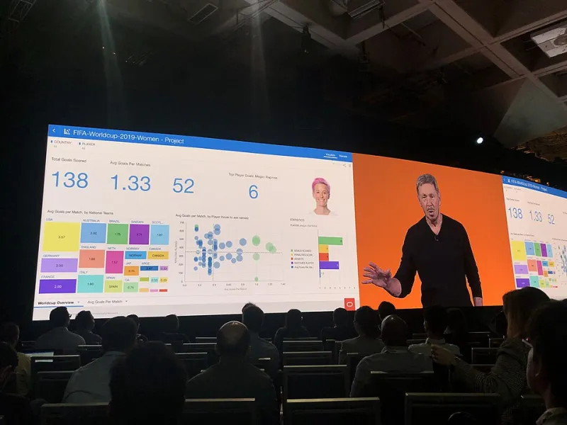
Photo: GeneralAB13, CC BY-SA 4.0, via Wikimedia Commons
Every quarter, finance teams across the country sit down to evaluate their software stack. They pull up dashboards, look at user counts, maybe check whether the license cost went up, and make a call on whether to renew. It feels like due diligence. In most cases, it's barely scratching the surface.
The metrics that actually predict whether a software tool will deliver real business value are rarely the ones front-and-center in vendor-provided dashboards. That's not always intentional — sometimes it's just that the obvious numbers are easier to track. But the result is the same: companies keep paying for tools that aren't working, or walk away from tools that are quietly delivering value they haven't learned to measure.
Here are five indicators that tend to get overlooked — and why they deserve a spot in your evaluation framework.
1. Adoption Velocity, Not Just Adoption Rate
Most organizations track whether employees are using a given tool. Far fewer track how quickly that usage is spreading through the organization after initial rollout.
Adoption velocity — the rate at which new users are activating and engaging with software over a defined period — is a leading indicator of whether a tool is solving a real problem or just being used because it was mandated. When adoption spreads organically, it usually means users are recommending the tool to colleagues. That word-of-mouth is one of the strongest signals that the product is genuinely useful.
Conversely, flat or declining adoption curves after the initial launch period are a warning sign worth taking seriously — even if total user counts look healthy. A tool that required heavy-handed rollout to reach its current adoption level will often plateau there, and the underlying lack of enthusiasm tends to show up in productivity outcomes eventually.
To track this properly, look at week-over-week activation rates for the first 90 days post-launch and compare them against cohorts from previous tools or industry benchmarks your vendor should be able to provide.
2. Feature Usage Distribution
Here's a number most vendors won't advertise: what percentage of your licensed users have ever touched any feature beyond the two or three core workflows?
Feature usage distribution reveals whether your team is actually leveraging the tool's capabilities or just using it as a slightly more expensive version of whatever it replaced. Narrow usage patterns aren't automatically a problem — sometimes a tool is worth its cost for one specific function — but they do indicate risk. If the vendor deprecates or changes that one feature, or if a cheaper, more focused competitor emerges, your switching cost suddenly drops to near zero.
Broader feature engagement, on the other hand, suggests that the software is becoming embedded in multiple workflows. That depth of integration is what creates genuine stickiness and measurable productivity gains.
Ask your vendor for a feature engagement report — most enterprise platforms can generate this data. If they can't or won't, that's worth noting.
3. Support Ticket Trends Over Time
Customer support volume is a metric almost every organization tracks, but the trend in that volume over time tells a more nuanced story than the raw number.
A high volume of support tickets immediately after implementation is normal and expected — users are learning the system. What you're watching for is whether that volume declines meaningfully over the following three to six months. A healthy adoption curve shows a sharp early spike followed by a sustained decline as users build competency and the tool's UX proves itself.
If ticket volume stays elevated or, worse, increases after the initial learning curve, you're looking at a UX problem that's unlikely to resolve on its own. Either the software has genuine design issues, your team hasn't received adequate training, or the tool isn't a good fit for the way your organization actually works. Any of those scenarios represents a real cost — in IT time, in user frustration, and in productivity drag.
Track support tickets by category too, not just volume. Tickets about the same recurring issue month after month indicate a structural problem that warrants a direct conversation with your vendor.
4. Time-to-Value for New Users
Enterprise buyers spend a lot of time evaluating software before purchase and surprisingly little time measuring how quickly new employees become productive with it after onboarding.
Time-to-value (TTV) — defined as the elapsed time between a new user's first login and the point at which they complete a meaningful workflow independently — is one of the most predictive metrics for long-term ROI. Short TTV means the software is intuitive enough that people get productive fast. Long TTV means you're paying for a tool that requires significant investment before it starts paying back.
This matters especially in high-turnover roles or organizations that are scaling quickly. If every new hire needs three weeks to become functional in your core business software, that's a quantifiable drag on output that compounds with headcount growth. A tool with a TTV measured in days rather than weeks can represent a significant competitive advantage at scale.
You can measure this internally by tracking when new users first complete key actions — submitting a report, closing a deal in the CRM, completing a project milestone — and comparing that timestamp against their onboarding date.
5. Retention Curves by Use Case
Aggregate retention numbers hide a lot. A software platform might show 85% annual retention overall while quietly losing all of its power users and retaining only the casual ones — which is almost the inverse of what you want.
Segmenting retention curves by use case or user role reveals whether the people getting the most value from the tool are sticking around, or whether the product is failing its most demanding users. In B2B software especially, power users tend to be the internal champions who drive broader adoption and renewal decisions. Losing them is a leading indicator of eventual churn at the account level, even if the overall numbers look stable for another quarter or two.
For founders evaluating their own platform and enterprise buyers assessing vendor health, asking for retention data segmented by user activity tier is a reasonable request. Healthy products retain their engaged users at higher rates than their casual ones.
Moving Beyond the Vanity Layer
None of this is to say that standard metrics like monthly active users or net revenue retention are useless — they're not. But they're lagging indicators. By the time those numbers shift meaningfully, the underlying problems have usually been building for months.
The five metrics above function as early warning systems. They surface issues while there's still time to address them — whether that means investing in better training, having a frank conversation with your vendor, or making the call that a tool isn't working before the next renewal deadline arrives.
Smart software investments aren't just about picking the right tool at purchase. They're about building the measurement infrastructure to know whether it's actually delivering — and having the discipline to act on what the data tells you, even when it's inconvenient.
The dashboard you're looking at right now probably isn't giving you that. The question is what you're going to do about it.

